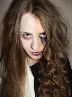
 This is a snapshot of the image once I had edited it using photoshop, wanted there t be distinctive differeance between the two characters so I used the dodge tool and the blur tool to make the skin look much paler on one side (I wanted the mental home patient to look tired and ghostly) I think that using the dodge and blur tool proved to be successfull as it make the mental home patient look very different to the villain, I think that she looks ill and ghost like which makes the image so much more scary and eye catching.
 My first idea was to draw a line between both sides so the viewer could diffrenciate between both images, however I though that this would drecrease the chance of my poster having a proffesional effect, after seeing what the image would look like with a line drawn down the middle, I thought that it looked acceptable but it was lacking something - I wanted the image to look more shocking and scary - so after experimenting with effects on photoshop I selected one half of my image, clicked on the 'image' option at the top clicked on 'adjustments' and began manipulating half of the image. This is an image of the poster image that I have been working on:
In this image I have made the villain look brighter - I did this by adjusting the hue/saturation of the selected half of the image. I made the mental home patient (left) look much more scary and dramating by saturating the colour, changing the coulor balance, changing the image from colour to black and white, making the exposure slightly higher and by changing the shaddow/highlight of the image (making the shaddow of the image higher). I feel that the alterations that I made on my poster has given it the scary edge that it needed.
No comments:
Post a Comment