On 31st of October we went to the media suite to edit the footage for our trailer using movie maker on the Apple Mac computers. Me and one of my team members uploaded the clips that we had filmed during the holidays onto the computer and then watched them back, as we did not film lots of the same scene we did not have to watch the same scene over and over. The scenes we looked at were of a good quality and we were pleased with them.
However after looking at the clip where it shows me (playing a ghost) appearing and then disappearing in the mirror, as we had filmed separate clips - the mental home patient looking in the mirror, was filmed as one clip, then the ghost standing in the mirror looking at the patient, was another, and then the mental home patient turning around looking scared after noticing was another. We found as these clips were all separate we could not merge them together so the scene did not flow properly, both me and my team member did not like that there was a pause before the ghost appears as it did not look very genuine. However after numerous attempts to try and merge the three clips we found that we were unable to link them together, which we did not like, but we did agree that the scene did still look effective but it would have looked better without the pause in between clips.
We looked at the clips and noticed that alot of them were far too long, we decided that we needed to get our trailer organised and put the clips that we had already filmed in the order that they would be shown in the trailer. To help us with this we wrote down what would happen in the trailer first, we talked about each clip in depth, as we found that our trailer appeared to be quite confusing so we got rid of one scene completely and changed some clips around so that the story was more clear in our trailer.
After having the order down in written form we then moved the clips from my camera to movie maker (we only used the clips that we had decided that we wanted to use). We put the clips in the order of which we intended them to be shown, we understood that there were clips that were yet to be filmed they were:
- The mental home patient getting her photo taken as she enters the home
- The mental home patient leaving the home
- The mental home patient walking down an alleyway ripping down the wanted posters of herself.
- The evil character screaming into the camera (the final scene)
We put the clips we had in order, so that our trailer was organised and we decided to change the order in which we planned. Also we had one scene where the mental home patient was in a circle of candles (shown below).
We decided that this scene was not really needed and was irrelevant to our film, we wanted to show the interesting and important parts so that the viewer would get a good knowledge of the film. This clip shows the character meditating, and trying to connect with the dead, however we felt that the clip looked quite amateur as it was filmed in daylight and it would confuse the viewer.
After making these decisions we watched the trailer in order and found that it was very long - we wanted it to start off slow but we found that it was far too slow which made the trailer seem boring and we really want to keep the viewer engaged in what they were watching.
We made lots of clips much shorter as we found that they were around 10seconds and this was too long, so we shortened then to around 4-7 seconds, which we thought was suitable to keep the trailer interesting.
We discussed sound that we wanted to use, and effects that we needed such as a camera flash and a fuzzy TV screen effect, which was inspired by the ring as the fuzzy screen made it seen really and much more scary and intense.
Overall I am pleased with the amount that we had got done in the lesson, as we now feel much more organised, however we were missing a member of the group, so we will need to tell her about all of the changes and progress we have made with the trailer. Next lesson we hope to start editing in the media suite on Final Cut.
Sunday, 30 October 2011
Filming
On Thursday 27th October my group and I went to St Osburgs church hall to film some of our scenes, in the previous week we had discussed that we should film both characters scenes separately as the villain requires very dramatic make up and very big dramatic hair, whereas the mental home patient is the very opposite, she has neat blunt straight hair and no make up, so it would be difficult to do both sets of make up in a limited time. So we filmed most of the scenes with the villain earlier and the scenes that we had to film today were only of the mental home patient.
When we arrived at the church we quickly sorted Shona's hair, costume and make up so that we could start filming. The first scene that we filmed was a scene showing the mental home patient walking in a straight line towards a set of doors, this scene would be at the start of our trailer and would show the mental home patient entering the mental home. For this scene we had to film it a few times until we were satisfied with how it looked, in the end we chose to film the patient from the back, and chose to use a long shot so that you could see the characters full body. The reason we chose to film the character from behind was to create a sense of mystery, also we thought that having the character walking away from the camera would make her see annonymous to the viewer. Overall I think that this scene had the scary unusual edge that we had wanted to create and I think that it is a very effective opening scene to our trailer.
 |
| Filming from a high angle |
The second clip that we had to film was of Scarlet (as the mental home patient) in her cell. For this clip we had all agreed that this should be filmed using a high angle shot as this would make the shot look like a realistic survailance camera. We found the high angle shot was hard to create at first we tried lifting the camera as high as possible but found that doing this would often make the camera shaky, so we did find that it took a while to get used to the angle. The scene would show Scarlet sitting very still on a chair, however as we wanted the viewers to see Scarlet clearly we opted to film this scene from a long shot rather that a high angle, we felt that this worked much better and looked much more effective .
 |
| Filming from a long shot |
Next we had to film the scene where Shona would be sitting on the floor rocking herself and crying - this would be because she was remembering her sister - this angle was done from a high angle shot as we thought that it was important to use a variety of shot types - we had solved this problem by filming the scene while standing on a bench and trying to keep as still and possible, we found that after a few takes we had got the scene we needed. Now we had to use a long shot again which showed Scarlet having a nightmare she would need to lie on the floor and roll around screaming and the jolt up , as we needed this scene to be dark we turned out the lights - in all of the scenes today we used a fuzzy film grain effect on my camera to make the footage appear 'old' in this dark scene we made sure that Shona could still be seen, we found this scene quite easy to film once having a 'practice run'. The scene would show Scarlet having a nightmare after the audience see her sister being murdered.
 |
| The Ghost Scene - looking at this shot you can see that I need to move forward as I am not very visible on camera. |
The final scene of the day would be Scarlet running into her old house and remenisimg - this scene would be before the mirror scene as in this scene she would noticice her old family mirror which is where she would see her sister.

For this scene Shona would run in and start to clean up her house, she would look around dazed and confused until noticing the old mirrot which she remembered from her childhood, this scene was an long shot so that the viewers would be able to see the whole house and look at everything that Scarlet was doing.

Thursday, 20 October 2011
Editing footage for trailer
On thursday, in our next lesson we uploaded our footage that we had filed over the weekend to the Apple Mac Computer, in the previous lesson we had chosen the clips that we had wanted to use, as we had filmed at least five takes of the same scene so that we would have a selection of clips to chose from, when we watched them back we found that in some the camera was far too shaky, or cut out the characters head. We uploaded the chosen clips and started to edit them we cut the clips to ensure that they did not run on too long and we changed the scenes that we to be shown as flashbacks in the trailer to black and white to do this we changed the bringhtness, contrast and exposure. This was done to make the clips look older to make it seem to the viewer taht the clips that they were seeing were from the past.
Editing in the media suite - practice clips
On Thursday the 20th of October our class went to the media suite and we told that we were to edit out footage on the Apple Mac Computers, using software such as Movie Maker and Final Cut. We split off into our groups and we able to try out the different effects on Movie Maker. Instead of going straight in to editing our final footage we started to edit a selection of documentary style clips to help us get used to the software.
We worked as a pair to edit the clips by drag and droping them into movie makes so we could cut the clips and merge them with other clips, we added sounds such as ' drone dark suspense' or 'camera flash' to look at sound effects that we liked, as we were doing this we found that there were alot of sound effects that we thought would be suitable for our trailer. We also found camera effects on movie maker such as.......................
We worked as a pair to edit the clips by drag and droping them into movie makes so we could cut the clips and merge them with other clips, we added sounds such as ' drone dark suspense' or 'camera flash' to look at sound effects that we liked, as we were doing this we found that there were alot of sound effects that we thought would be suitable for our trailer. We also found camera effects on movie maker such as.......................
Wednesday, 19 October 2011
Mintute meeting - refine trailer in steps
On Tuesday 11th October my team members and I had a meeting about what we wanted to show in our trailer we noted down in order what would happen in the trailer.
I took notes of what will happen in the trailer in each step;
Beginning of trailer:
Corridoor Scene -
We will see the back of the mental home patient as she enters the mental home (behind the shoulder shot)
(FLICKER)
Camera Flash
Mental home patient hold a patient sign as she gets her picture taken.
Patient will sit on a chair in her cell staring at the camera with her eyes wide (She know that she is being watched) (high angle shot as she sits in the room and looks up at the camera).
--FLASHBACK-- (Black and White)
Mental home patient and her sister on sings.
Mental home patient and sister playing in a field.
Back to colour
-Mental home patient rocking on the floor in her cell
MOVE ON TO ANOTHER SHOT
- We then see the mental home patient crying after remembering her sister.
FLASHBACK
'Villain behind the sister (who is on the swing) with the murder weapon (croebar)
Mental home patient sitting in her cell starting to get hysterical - she hits the walls, screams and starts to frantically rip her hair our.
She starts banging and scratching the walls she tries to escape the cell.
TRANSITION - which will be done in the editing suite
Mental home patient running down an alleyway looking behind her (She has escaped the mental home). She sees a wanted poster of herself, she tears it of the wall (camera zooms into poster).
Mental home patient enters her old family home......
She walks upstairs (which will be filmed on the stage in St Orsburgs)
4 steps - She sees an old photos of her and her sister and gets upset.
She walk over to an old mirror (drops the photo) - in a longshot we see her looking in the mirror and her sisters reflection appears out of nowhere (her sisters ghost).
She turns around and her sister is not there.
She runs away (past the camera)
We then see the villain or alter ego
We see the mental home patient walking into the woods and then it switches to show the villains scene,
- she is in the oark communicating with the dead (she is alone in the wood with a circle of candles around her)
The villain then walks across the bridge holding the croebar (on her way to murder the sister).
She screams into the camera she growls at the camera and says something - her face is only seen clearly at the end.
END OF TRAILER.
Minute meetings: choosing a magazine name
As I had a list of names that I had come up with for our magazine I showed my group the list of names and discussed with them which ones we thought were the strongest, my favourites (which I had shown in a list on my previous post) were Rewind, Theatre Thrillers, Flashforward, Final Cut and The film spy.
Enitially my group did not like the title the film spy as they felt that it was too long for a magazine name, however we discussed within the group which was the strongest, most different and relevant name and eventually agreed on 'The Film Spy' as our magazine name.
I am glad that we agreed on this title as I think it has an edge to it, it is informative and creative, our magazine is about new film releases, reviews and sneak previews, so the name itself shows that it is about insider information on new film releases which will attract film fans.
Alot of people will want to read about yet to be released films, so the title itself is strong and effective as it will make the reader curious and intregued.
I will now work on my magazine masthead as I now know what title is being used, below are my first attempts of mastheads:
Monday, 17 October 2011
Film title
Minute meetings
As a group we had to discuss what we wanted our film to be called, after changes to our storyline, we decided that once we had our final storyline completely refined we would choose a name for the film that best reflected our film and had a edge to it, something that would really stick in the readers mind.
After a brainstorm in the group, I had came up with the name 'Who Am I?' which my team members had said they like the sound of as it was a rhetorical question that would really make the viewers think.
The question itself is very unusual, as it is a very uncanny question to ask ' who am I', it reflects the characters struggle for her identity as in our trailer she does not know that she is a vicious murderer. I like the name as it will confuse the reader and make them question themselves, and it does reflect our characters mental state - the title itself would represent her confusion, innocence and vulnerability, so I think that the title that we have chosen is very well suited to our film.
Magazine name
For our promotional package we will be producing a magazine promoting the film, but first we will need a name for our magazine, here is a list of magazine names that I have come up with:
Silver Screen, Five Star, Screen Star, Movie Magic, Screen Queens, Scare Screen, Fright films, Preview Pass, Future Films, Spoiler, The Film Spy, Final Cut, FlashForward, Feature, Final Cut, Golden Screen, Hollywood Hits, Making Movies, Film Fanatic, Cinematic, Motion Movies, Theatre Thrillers, Motion Pictures, Motion Magic, Movie House, Rewind and/or FastForward,
This is a list of names that I have come up with as potential magazine names, I will need to discuss my ideas with my group to see which one they like best and then this will be our final name. The names that I have chosen are all film related but I have not chosen a name that related to the horror genre as we had already decided as a group that we wanted a more general name so that the magazine is more open to all genres of film.
The names that I like the most are ' The Film Spy', 'Cinematic', 'Rewind', 'Motion Movies', 'Final Cut', 'FlashForward', 'Golden Screen', 'FastFoward', 'Future Films' and 'Theatre Thrillers'.
The names are all film related so that a reader would know, by the magazine name, what the magazine will be about, by using cinema or film realted words it has made the magazine become more relevant to films and reviews.
I will discuss my ideas for names with my group so that we can choose a final name and we can start finalizing our magazine mastheads.
Poster
For my poster I have decided to use a half half image of both characters, the mental home patient and the villain. I plan to edit my poster using photoshop and I will take snapshots of the changed made to the image and my poster.
 This is a snapshot of the image once I had edited it using photoshop, wanted there t be distinctive differeance between the two characters so I used the dodge tool and the blur tool to make the skin look much paler on one side (I wanted the mental home patient to look tired and ghostly) I think that using the dodge and blur tool proved to be successfull as it make the mental home patient look very different to the villain, I think that she looks ill and ghost like which makes the image so much more scary and eye catching.
 This is a snapshot of the image once I had edited it using photoshop, wanted there t be distinctive differeance between the two characters so I used the dodge tool and the blur tool to make the skin look much paler on one side (I wanted the mental home patient to look tired and ghostly) I think that using the dodge and blur tool proved to be successfull as it make the mental home patient look very different to the villain, I think that she looks ill and ghost like which makes the image so much more scary and eye catching.
 My first idea was to draw a line between both sides so the viewer could diffrenciate between both images, however I though that this would drecrease the chance of my poster having a proffesional effect, after seeing what the image would look like with a line drawn down the middle, I thought that it looked acceptable but it was lacking something - I wanted the image to look more shocking and scary - so after experimenting with effects on photoshop I selected one half of my image, clicked on the 'image' option at the top clicked on 'adjustments' and began manipulating half of the image. This is an image of the poster image that I have been working on:
In this image I have made the villain look brighter - I did this by adjusting the hue/saturation of the selected half of the image. I made the mental home patient (left) look much more scary and dramating by saturating the colour, changing the coulor balance, changing the image from colour to black and white, making the exposure slightly higher and by changing the shaddow/highlight of the image (making the shaddow of the image higher). I feel that the alterations that I made on my poster has given it the scary edge that it needed.
Storyboard
To help us with the organisation of our trailer and the order in which each clip will follow in, we have decided to draw out the storyboard rather than using pictures as we have alot of costumes, props and settings we will need to use if we were to take photographs.
We will use simple pictures and text underneath to describe what is happening in each scene, our trailer will follow a specific order and we want it to get more fast paced as the trailer progresses as this is what we have seen in alot of the most effective horror film trailers, so we have decided to add the more scary and striking scenes (featuring the villain) towards the end of the trailer.
This is a snapshot of what our story board looks like, I drew the images in each box showing what will happen in each clip, as a group we decided what will happen and how many seconds we are hoping each clip will take up. This has helped us to organise our trailer so that we will be fully prepared when we start filming.
This storyboard shows that we will start off with the mental home patient, entering the home sitting alone in a secluded room having flashbacks of her and her sister, and reminiscing of her childhood, the trailer will then show her seeing her sister being murdered and her mental state gets worse, the killer will remain a mystery until the end of the trailer, but throughout the trailer it will be obvious that the mental home patient does not know that she is the killer.
Saturday, 15 October 2011
Filming
On Saturday 15th September my team member and I went to Ausley park to begin filming parts of our trailer, we decided that we would not film both characters at one as this would include alot of time being taken up by doing hair and make up for both the mental home patient and the villain.
We decided that we would film the main character and her sister playing together as children, as these scenes require the characters to wear 'normal' clothes and we would not need to put too much time into hair, make up and costume.
The scenes that we needed to film were the flashbacks that the mental home patient would have of herself and her sister playing happily before her sister was murdered. These scenes will be edited in the media suite and made to be black and white to make the clips look older and so there can be a distinction between the flashbacks and real life in the trailer.
Costume and make up - Mise en scene
For our main character Scarlet (played by Shona) we wanted her to look childlike and innocent so we decided that she should wear a dress, the colour of her dress was not really a problem as the clip would be shown in black and white, but we did discuss that she should not wear anything black as we did not want there to be any similarity between the metal patient as a child and the villain as we do not want the viewer to know that they are the same person. The character wore no make up as we wanted her to appear fresh faced and young, and we chose to halve her hair natural and slightly curled.
In the flashbacks the patient will have, there will be two characters the mental home patient and her sister, in our casting session we had decided that the part of the sister would be played by myself, we wanted the sister (who we decided to call Elizabeth, one of the potential names for our main character, who we decided to call Scarlet) to look younger and again childlike and innocent, we decided for her to wear a white dress to show innocence and purity, and also as we show the villain murdering Elizabeth, the villain will wear black and the victim will wear white, so the colour will contrast showing the contrast in both characters personalities, both colours black and white are symbolic and relate to the characters. We chose to have her hair curly so that there would be some similarity with the characters to show that they are linked. Elizabeth is Scarlets adoptive sister (but Scarlet does not know this) so we wanted there to be an obvious difference between the characters so that they did not look exactly the same.
The first flashback that was filmed shows both sisters playing happily on the swings, this was supposed to be one of Scarlets happy childhood memories, so we wanted both girls to look happy. We chose to have the girls on the swings, we found a set of just two swings which was perfect as we were able to show the girls playing together on two swings that were away from anything else.
The swings are relevant to the film trailer as this is where the girls would meet as children, and it would later on in the trailer be the place where the sister would be murdered. We used the swings so that in the murder scene it would look like Elizabeth is waiting for her sister to come.
In the next flashback, we filmed the scene in a field full of flowers, we liked the visual aspect of filming in this setting in particular, also as it is a happy flashback we wanted the flowers to be symbolic of innocence and happiness, the setting in which we filmed the flashback made it look much more appealing and effective.
In the clip (which will last around 2-5 seconds) it shows the two sisters running around and playing in the fields, this will show the happier memories of Scarlet.
After filming these flashbacks we decided that we would film the scenes showing the villain, we changed Shona's costume to a black lace dress (we had already decided the colour of Shona's character would be black as it was symbolic of evil) with a netted black skirt layered over the top, this gave the character a witch-like haunting vibe, we wanted the character to look older than the younger girl in the flashbacks, so we used high heeled black lace up boots to make her look taller and older, the shoes we used we just wanted to create height but the colour had to be black as we want the characters costume (colour) to represent her personality.
I used black, gold and purple eye - liner, like in the photoshoot I creadted a dramatic feathered effect the eye make up was very over the top and eccentric which is what we wanted our character to be reflected as, also the use of the black liner made Shona look frightening and unusual.
In the first clip featuring the villain we decided to have Shona walking across a bridge, again we liked the visual aspect this would create, below is a snapshot I took between fiming of Shona on the bridge:
 The bridge had trees and branches in the background which gave the setting a more sinister and scary effect, also the scene itself would look very unusual as the bridge is very high up so it would make the viewer feel scared and uneasy. In this scene we would show Shona walking across the bridge with the murder weapon (a croebar) we decided against using the bat as we felt that the croebar would look like a much more convincing murder weapon. The scene would show the character on her way to the park to murder her sister, we felt that this scene would be at the end of our trailer because we wanted it to get more scary and fast paced towards the end. The villain walks slowly towards the camera carrying the croebar, this creates an eerie sense of reality, as the character walks towards the camera it looks as if she is walking towards the viewer which will really put them on edge. We plan for this clip to last again 2-4 seconds as we want the ending to be extremely fast paced.
After the scene of the bride we had decided previously in the week that we wanted to have a scene where the character appeared to be possesed and communicating with the dead, we wanted our character to be in the centre of a cirle of lit candles to make her look like she is meditating, this scene was quite strange and surreal but it would reflect Scarlets evil person, we found it very difficult however to light the candles as they would keep blowing out in the wind and when they were lit because it was daylight they would not show up on the camera.
We decided that we would film the main character and her sister playing together as children, as these scenes require the characters to wear 'normal' clothes and we would not need to put too much time into hair, make up and costume.
The scenes that we needed to film were the flashbacks that the mental home patient would have of herself and her sister playing happily before her sister was murdered. These scenes will be edited in the media suite and made to be black and white to make the clips look older and so there can be a distinction between the flashbacks and real life in the trailer.
Costume and make up - Mise en scene
For our main character Scarlet (played by Shona) we wanted her to look childlike and innocent so we decided that she should wear a dress, the colour of her dress was not really a problem as the clip would be shown in black and white, but we did discuss that she should not wear anything black as we did not want there to be any similarity between the metal patient as a child and the villain as we do not want the viewer to know that they are the same person. The character wore no make up as we wanted her to appear fresh faced and young, and we chose to halve her hair natural and slightly curled.
In the flashbacks the patient will have, there will be two characters the mental home patient and her sister, in our casting session we had decided that the part of the sister would be played by myself, we wanted the sister (who we decided to call Elizabeth, one of the potential names for our main character, who we decided to call Scarlet) to look younger and again childlike and innocent, we decided for her to wear a white dress to show innocence and purity, and also as we show the villain murdering Elizabeth, the villain will wear black and the victim will wear white, so the colour will contrast showing the contrast in both characters personalities, both colours black and white are symbolic and relate to the characters. We chose to have her hair curly so that there would be some similarity with the characters to show that they are linked. Elizabeth is Scarlets adoptive sister (but Scarlet does not know this) so we wanted there to be an obvious difference between the characters so that they did not look exactly the same.
The first flashback that was filmed shows both sisters playing happily on the swings, this was supposed to be one of Scarlets happy childhood memories, so we wanted both girls to look happy. We chose to have the girls on the swings, we found a set of just two swings which was perfect as we were able to show the girls playing together on two swings that were away from anything else.
The swings are relevant to the film trailer as this is where the girls would meet as children, and it would later on in the trailer be the place where the sister would be murdered. We used the swings so that in the murder scene it would look like Elizabeth is waiting for her sister to come.
In the next flashback, we filmed the scene in a field full of flowers, we liked the visual aspect of filming in this setting in particular, also as it is a happy flashback we wanted the flowers to be symbolic of innocence and happiness, the setting in which we filmed the flashback made it look much more appealing and effective.
In the clip (which will last around 2-5 seconds) it shows the two sisters running around and playing in the fields, this will show the happier memories of Scarlet.
After filming these flashbacks we decided that we would film the scenes showing the villain, we changed Shona's costume to a black lace dress (we had already decided the colour of Shona's character would be black as it was symbolic of evil) with a netted black skirt layered over the top, this gave the character a witch-like haunting vibe, we wanted the character to look older than the younger girl in the flashbacks, so we used high heeled black lace up boots to make her look taller and older, the shoes we used we just wanted to create height but the colour had to be black as we want the characters costume (colour) to represent her personality.
I used black, gold and purple eye - liner, like in the photoshoot I creadted a dramatic feathered effect the eye make up was very over the top and eccentric which is what we wanted our character to be reflected as, also the use of the black liner made Shona look frightening and unusual.
In the first clip featuring the villain we decided to have Shona walking across a bridge, again we liked the visual aspect this would create, below is a snapshot I took between fiming of Shona on the bridge:
 The bridge had trees and branches in the background which gave the setting a more sinister and scary effect, also the scene itself would look very unusual as the bridge is very high up so it would make the viewer feel scared and uneasy.
 After the scene of the bride we had decided previously in the week that we wanted to have a scene where the character appeared to be possesed and communicating with the dead, we wanted our character to be in the centre of a cirle of lit candles to make her look like she is meditating, this scene was quite strange and surreal but it would reflect Scarlets evil person, we found it very difficult however to light the candles as they would keep blowing out in the wind and when they were lit because it was daylight they would not show up on the camera.
Our final scene was when Scarlet would murder her sister, for this scene we went to the swings again as I was playing the sister I would sit on the swing while Shona came up behind me slowly with a crowar, we would not show myself getting hurt as the clip would stop when Shona raised the crowbar to my head. This scene had to be shot quite alot as sometimes Shona would not be visible behind me or the crowbar as it was heavy slipped out of Shona's hand or could not be seen through the camera lens, however we were able to work out the problems by moving the camera closer and eventually Shona got used to the crowbar.
Sunday, 9 October 2011
Final Poster Photoshoot

As I had wanted to do a half half face showing both characters for my film poster I had decided to do another photoshoot so that I could put two different styles of make up on each half of the models face, so it would represent both characters. I am very happy with the photo's as it presents the idea I had very well and now I have the final images for my poster.
Below are the photographs that I had taken, which I will now use for my poster:

 This final image is the one that I have decided to use for my poster as it captures both characters extremely well. I like the angle as she glaring up at the camera, and you can see both sides of her face very well, it is a very strong eye-catching photo as it is unusual and makes you look twice. The emotion shown by both characters is anger, which is good because the mental home patient is angry and out to seek revenge, whereas the villain is evil, and a killer so the facial expression relates to both characters I especially like the anger in her eyes as it portrays the fierce angry personality of both characters.
 Thursday, 6 October 2011
Practice trailer - First Draft
On Thursday, my team members and I started filming, we needed to make a first draft of our trailer so that we could look at it a critically analyse it. We filmed our draft trailer in school, and we made it very simple, we just filmed one character as we did not use any different styles of hair or make up that will be featured in our film. We practised filming in the mound at school as it is an eerie secluded spot, we filmed footage showing both personalities of our character, we started off with having our character skipping and running around, and being seemingly innocent and childlike, reflecting her pure innocent side. We then showed the character becoming more irritable and aggressive and she begins to throw things and screams hysterically, showing her crazed and violent side.
As for camerawork we used a hand held camcorder to follow the character into the woods to create a realistic effect to our film, throughout the trailer the camera follows Shona, as if we were really there with her, making the ending seem scarier as Shona runs towards the camera and screams, then the camera tilts as if it has fallen. This made our trailer more scary as when Shona comes towards the camera it looks like she is chasing after us, scaring the viewer into feeling that what they are seeing is real. Also the hand held look, makes the film look home made, it is different to other films as it looks like the viewer is a part of the film world.
In our trailer we edited the footage using movie maker we decided to use and old black and white effect and we made the film motion slightly slower so that each movement Shona made was exaggerated, this created an old film style effect. Our films is set in the past (1950's) so we do want it to have a old look to it, overall I think that our first draft turned out well and has helped us to become more familiar at using movie maker.
We have looked at the trailer and discussed what we would do differently, we have decided to make the flashbacks that our character has of her sister will be in black and white to make it look older (as it will be in her past) and so there is a distinction between what is happening to her at present and what memories she is reflecting back on.
Monday, 3 October 2011
Poster images

For my poster I had initially planned to do a half/half image that showed half of each characters face, after trying many different compositions, it became very complicated and difficult. Below is an image of two photographs that I have tried to merge together. I want my image to link together well and look natural, this is an image that I have found that is quite similar to what I have been trying to create, on one side she looks pale and dramatic, with bold black make up similar to what I had drawn on our actress - it has quite a scary, high fashion look, and on the other side we see something that looks more natural. She has straight hair and tanned skin, there is a clear distinction between the two halves as the skin tones are very different. However you can tell it is the same model as the cheekbones, eyes, nose and lips are even - which is how I have been trying to get my image to look. I have now decided to use this method for my poster, instead of connecting two images, I will apply two different make up styles on each half of our actress' face so that like this image each half of her face looks like a different person.
Below are some of my previous attempts before coming up with a much simpler idea:

In this image I like both expressions - I have used an old photo that we had taken in the summer on the right, it was intended to be our characters mugshot - I like the dark fierce glare the character gives as it is striking and sinister.
The left side shows one of the more recent images that we had taken - the characters eyes are a strong, bold blue - which I made brighter using photo shop, the dramatic eye make up really stands out, I like both of these images but the are not of a similar size or angle to match together.


 This image that I have edited creates an entirely different effect from the first manipulated image of the mental home patient. The eyes are a much darker shade of blue, making the character look somewhat sinister and dark. I think this is good because it shows that there is a darker side to the mental home patient. The green in the background created a rather grungy effect, the character looks less sweet and innocent and more vengeful and evil. The colour of her outfit, the bold, bright white, makes her seem pure and innocent, but her facial expression and the dark background contradicts that. I like this because her image in general makes her seem innocent, her childlike face, blue eyes and white dress. But her expression shows another side to her, so it rightly hints that this girl is not all she appears to be. The lighting shines directly one her face making her face strikingly visible, it also makes her have quite a ghostly vibe.
  This is one of the more scary images, before it was edited I think it looked messy,
 but after I changed the brightness and contrast it looked more striking and unusual. In this image the hair is covering the face, and looks tangled and messy, showing that the character could be uncared for, her face is revealed through the hair - she looks shocked and angry, her eyes are wide open and this, gives a very haunting, ghostly effect. It is almost like she is hiding herself behing her hair and her 'mask' has been revealed, explaining her shocked, angry expression. The white again could be symbolic - in this image it looks heavenly, suggesting that the girl could actually be a ghost her body disappears into the background, as if to suggest the girl is un-human. The face in this image is striking as it looks slightly out of place in the background, making the image look more surreal, which I do like. The white looks angelic and pure, making a viewer assume that this girl is superhuman, or innocent, which is not in fact true, so the image would trick the reader as they would make assumptions on the character, making them curious as to what she is really like.

This image is of our trailer's villain, I have changed the brightness of this image to make the face really stand out, the eyes have also been changed to look more bold and bright - reflecting innocence which contradicts against this scary image.
This image is very direct and frightening so manipulating the colour just made it stand out even more. The cold and purple in the eye make up is made to stand out more showing the characters eccentric style. The colours of the make up contrast against the girls bright white skin making the image even more eye catching.
 This next image, I made to look much brighter I made the eyes look a shocking, unusually bright blue, making the character look more scary and giving the eyes a strong impact making them the main focus. The flowers are bright and bold a make the colours in the image strong and dominant - I wanted and image to be really eye catching and the use of colour makes it unique.
 This is an older image that was taken in the summer, I like this image as the character is glaring right at the camera making her look evil and sinister. We have changed the image alot from the time that this image was taken, this was the image for the mental home patient, we wanted her to seen quite extravagant and deranged, her hair was curled and backcombed to make it look messy and over the top, her make up is smudged as we wanted her to look grungy, we used black make up so that it would look bold and it could also hint to our characters dark nature, I do like this image and the make up but I feel that the make up we have now used (in the image above) is much more dramatic and eye catching. In this image the character holds a patient sign which is relevant to the film as it will be shown in our trailer, also using this image in a poster would hint to the reader what the film is about. The costume in this image was also symbolic as we used a red dress to symbolize blood and death and gore, so again it could hint to our characters evil nature.

This image is of our trailer's villain, I have changed the brightness of this image to make the face really stand out, the eyes have also been changed to look more bold and bright - reflecting innocence which contradicts against this scary image.
This image is very direct and frightening so manipulating the colour just made it stand out even more. The cold and purple in the eye make up is made to stand out more showing the characters eccentric style. The colours of the make up contrast against the girls bright white skin making the image even more eye catching.

 This is an older image that was taken in the summer, I like this image as the character is glaring right at the camera making her look evil and sinister. We have changed the image alot from the time that this image was taken, this was the image for the mental home patient, we wanted her to seen quite extravagant and deranged, her hair was curled and backcombed to make it look messy and over the top, her make up is smudged as we wanted her to look grungy, we used black make up so that it would look bold and it could also hint to our characters dark nature, I do like this image and the make up but I feel that the make up we have now used (in the image above) is much more dramatic and eye catching. In this image the character holds a patient sign which is relevant to the film as it will be shown in our trailer, also using this image in a poster would hint to the reader what the film is about. The costume in this image was also symbolic as we used a red dress to symbolize blood and death and gore, so again it could hint to our characters evil nature.
 Sunday, 2 October 2011
Photoshoot - featuring the second character
On Thursday the 29th me and my group decided to do another photo shoot, but this time with our characters second personality - the mental home patient, I feel that as the film trailer will feature both characters we need to include these characters in either our poster or magazine.
I plan to do my poster in a half/half effect on one side will be half of one characters face (the villain) and on the other character face (the mental home patient). I think that this is a good idea for my poster as it will show the audience that the two characters in some way are linked and this will make them curious and increase their interest in the film.
After our questionnaire and interview we found that the poster has a large impact on whether our target audience go to see a film, so with this evidence I feel that the poster needs to be incredibly striking and effective.
I think that featuring both characters in the poster would be very effective as it will show their importance to the film.
The first set of photos (of the villain) were incredibly striking and effective so I had hoped that our next set of images would be equally strong. It was important that both characters look very different as we do not want our audience to guess too much about the film. I feel that in this next set of photos the character is not as bold and dramatic, but they do look different, which I am happy with. Overall I do not think that our second photo shoot was as successful as the first as there were no photos that were particularly striking or scary, I think more than anything it was because we struggled to get the emotion and anger of the mental home patient shown through the photos. Overall I am much happier with using the photos of the villain, as her dramatic eye make up made the character more eye catching and suited to be on a poster, whereas the ones taken of the mental home patient I do not like as much as they look quite dull and the character in many looks bored or sleepy.
These are the photos that we have taken,
The first five are the ones that I liked best:
 This I feel is one of the stronger images that were taken, in this image I like the angle, as directed we wanted to shoot slightly above our model to elongate the face, and make the eyes look much larger and striking. I do like the angle of the face as it makes the character look sinister and vengeful. This is the only image in which the character looks angry, showing that she is not as innocent as she seems. We straightened the hair to stick to horror film conventions and create a ghost like look, like the characters in horror films like 'the grudge' and 'the ring'. The white dress symbolises innocence and purity and we wanted the characters innocent side to be reflected well, and I think it is through the use of mise en scene.
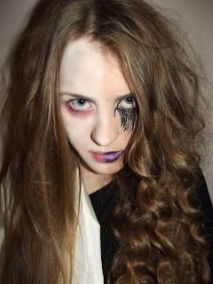
 This image is quite similar to the first however it is more of a close up and the eyes are much wider the eyebrows are furrowed and so she looks quite evil, but there is a childlike smirk on her face I like the redness under her eyes (which was done using red face paint to create a sleepless look). The red under the eye could be symbolic of blood and gore, and it makes the character look stressed and sleepless which is what the persona of the mental home character is. I think that this was the best image that was taken as the angle elongates her face and is more flattering that the others, I like the soft, serious look her smile is slightly innocent and intriguing - her facial expression looks quite secretive
 I do not really like the expression in this image as it doesn't look very realistic, and I think the hair is on the face which spoils the perfect neat look we wanted the straight hair to create. Also I think at this point the make up had rubbed off and it does not look as effective. This close up shot is not really ideal as we wanted to put an emphasis on the dress and the long hair but you cannot really see them in this shot.
 In this shot we see actress Shona looking deranged and uneasy, I like this image as I feel that it reflects Scarlets true emotions quite well, although we want to portray Scarlet as gentle, fragile and innocent at the start of the trailer this image reflects that she is not as innocent as she appears, and is in fact mad and aggressive. I like the tilted angle of Shona's face as it works much more effectively that the images of her being perfectly still, her expressions and body language go together suggesting that she is frustrated and angry. I like how intense and strong her eyes look in this image and the way they look directly into the lens makes a viewer feel quite tense as she is looking directly at them.
 This next image is quite unusual and strange to look at the angle of her face is very unusual and changes the way her face shape appears. As she has her mouth open and her chin down, her face looks rather triangular and her eyes look much bigger, making her look more scary and unhinged. I like the image as it makes Scarlet seen unusual and pained, it reminds me of posters I have seen for the grudge as the main character, Kayako always appears wide-eyed with her mouth wide open making her look much more frightening for the viewer as the way her face is distorted suggests agony or pain.
  This is a long shot of actress Shona, here you can see that her look is very contrasting to her other personality of the villain. Here I think that Shona looks quite innocent, childlike and vulnerable reflecting the characters more innocent side, I like this image but I think that the close-up shots have a stronger impact on a viewer then this long shot does. The use of a long shot enables the viewer to look at the whole of the character, what they are wearing and their surrounding environment. However by using a close up a viewer would be forced to look directly at the characters face and analyse the expression and close ups create a much more intense sinister vibe as the main character would be staring straight at the viewer which would draw them in more.
 I like the anger in this shot, the expression shows extreme anger, however I still feel like this image is not strong enough as it is quite blurred. I like the expression and the bags under her eyes as she looks tired, frustrated and restless, which is the emotional rage that we wanted this character to reflect. I think that this image is very serious and intese, but the expression would relate more to Scarlets evil personality rather than her more innocent persona that these new images we trying to portray.

In this image the character looks quite bored, and the photo is not really suitable for a magazine or poster as it is not really eye catching and does not portray anything about the character - in this photo I feel that no emotion comes across and I would have like the image to look more frightening. This could be resolved by making her look paler, tidying her hair, and also I do not like the angle.
I plan to do my poster in a half/half effect on one side will be half of one characters face (the villain) and on the other character face (the mental home patient). I think that this is a good idea for my poster as it will show the audience that the two characters in some way are linked and this will make them curious and increase their interest in the film.
After our questionnaire and interview we found that the poster has a large impact on whether our target audience go to see a film, so with this evidence I feel that the poster needs to be incredibly striking and effective.
I think that featuring both characters in the poster would be very effective as it will show their importance to the film.
The first set of photos (of the villain) were incredibly striking and effective so I had hoped that our next set of images would be equally strong. It was important that both characters look very different as we do not want our audience to guess too much about the film. I feel that in this next set of photos the character is not as bold and dramatic, but they do look different, which I am happy with. Overall I do not think that our second photo shoot was as successful as the first as there were no photos that were particularly striking or scary, I think more than anything it was because we struggled to get the emotion and anger of the mental home patient shown through the photos. Overall I am much happier with using the photos of the villain, as her dramatic eye make up made the character more eye catching and suited to be on a poster, whereas the ones taken of the mental home patient I do not like as much as they look quite dull and the character in many looks bored or sleepy.
These are the photos that we have taken,
The first five are the ones that I liked best:


 I do not really like the expression in this image as it doesn't look very realistic, and I think the hair is on the face which spoils the perfect neat look we wanted the straight hair to create. Also I think at this point the make up had rubbed off and it does not look as effective. This close up shot is not really ideal as we wanted to put an emphasis on the dress and the long hair but you cannot really see them in this shot.
 This next image is quite unusual and strange to look at the angle of her face is very unusual and changes the way her face shape appears. As she has her mouth open and her chin down, her face looks rather triangular and her eyes look much bigger, making her look more scary and unhinged. I like the image as it makes Scarlet seen unusual and pained, it reminds me of posters I have seen for the grudge as the main character, Kayako always appears wide-eyed with her mouth wide open making her look much more frightening for the viewer as the way her face is distorted suggests agony or pain.


In this image the character looks quite bored, and the photo is not really suitable for a magazine or poster as it is not really eye catching and does not portray anything about the character - in this photo I feel that no emotion comes across and I would have like the image to look more frightening. This could be resolved by making her look paler, tidying her hair, and also I do not like the angle.
Subscribe to:
Posts (Atom)