
For the second part of my research I will look at movie posters, to help me come up with ideas for my own poster. Over the summer I have been looking at many different horror film posters and analysing what it is about them that makes them interesting, mysterious and visually appealing. For me I feel that the posters that promote films have a strong affect on viewers and I want our final poster to be captivating and intriguing for a viewer, which is why I have carried out a very detailed analysis of posters promoting my chosen genre of horror.
This is a poster for 'The Strangers' which is a film about a couple whose home is invaded by three strangers who are trying to kill them. The film overall is very frightening as it has an eerie sense of reality. The film was based on a true story so I think that this makes it seem more scary as it makes us think that this could happen to anybody, which I this creates a genuine sense of horror' as it puts viewers on edge.
The poster advertises the film very well as it shows the couple sitting next to one another with their backs turned to us making us feel oblivious to who they are. We then see three masked strangers standing over them, looking down at them, they are all wearing scary masks making us feel both curious and scared as they are unknown and mysterious. What makes the poster more chilling is that the masks they are wearing are very scary on their own - the masks are ghost like, the two girls are wearing doll-like masks portraying a sense of youth and innocence and they are all dressed like everyday people we see on the street making us feel paranoid and insecure.
Also as we look further down into the poster the picture fades into darkness - showing fear and mystery. Also the title is a bright luminous white against the black - which could be foreshadowing as the light could signify heaven and the colour black against it could signify death and decay.  This is another poster that I have found effective, the film is called Silent Hill, and is another horror film so it relates to my chosen genre.
In one image we see a woman with her hands on her ears as if to block out a loud piercing sound - which is ironic as the title of the film is called 'silent hill' so we would imagine the poster to be simple like the simplicity and 'peacefulness' of the title. Instead it is busy and loud so the title and the poster contradict each other.
The title is in the middle of the poster so that we are instantly drawn to it. It is bright white and misty giving the poster an eerie, ghost like vibe .
The images overlap each other to show that all of the characters could be linked in some way, all of the look frightened and disturbed suggesting that the is something in the film that is truly terrifying making us curious and eager to see the film.
Also I have noticed that all of the characters look frightened except for the little girl in the top left corner. This could suggest that she could be evil or their could be a secret behind her, linking to the mysterious vibe we get from the rest of the poster.
 This poster is for a the horror film 'Dread' the film is about three students working on a school 'project' to find out people's greatest fear. However one of the students has an ulterior motive a begins an experiment where he makes his friends fears come to life.
The poster does not give away much about the film, so it really does make the viewer think.
Overall I do like the simplicity of the poster as it keeps the main focus on the girl sitting in the corner, she looks very disturbed so it makes us wonder what has happened to her.
She is sitting alone from what we can see, however the walls get darker the more further away the are from the girl which could suggest that something is lurking in the darkness.
Also something that I particularly like about the poster is that the title is apart of the image - the work DREAD is written on the floor leading up to the girl, in what seems to be blood - making us this of death and it makes us wonder whose blood is it? Also the poster is black and white - which seems very dull and depressing but also sinister and serious. The film has a strong element of mystery making the viewer curious and intrigued would thus encourage them to watch the film.
 This is a poster for the psychological horror 'The Return' I really find this poster effective as it is very realistic looking this poster looks as if there is actually a persons hand in the eye of another person - giving the impression of being trapped or imprisoned in another persons body. The eye of the person looks ghost like as it is very pale and 'icy looking', also the eye has no iris making us curious as to the reason behind it, also the eye is clear to show us that their is a hand trapped behind it. The eyes are often described as the ' windows to the soul' so it could suggest that the film is about someone who is possessed as that would mean that they are trapped in their own body. As the poster is very eerie and has lots of meaning it leaves alot for the viewer to think about but it does give clues - such as the misty colour and the empty eyes that the film is about a ghost. Also something I have noted about all of the horror film posters is that they have a sinister tag line, the tag line for the return is ' THE PAST NEVER DIES. IT KILLS.' this tag line is short but makes us think so much 'the past never dies' makes us think of memories and our pasts, but then it ends with: 'it kills.' This gives the tag line is sinister scariness, as it makes the reader think about what it could really mean - the word kill instantly makes us think - fear, pain, death and murder which insinuates that this is what the film is about.
What attracted me to this poster was the strong, striking
image, the golden eye was the first thing that made me notice the poster - if we look closely you can see that there is a figure reflected to us in the eye - we can see an entirely white silhouette, it does not look human and it makes us curious as to what the figure really is. Also we see the furrowed eyebrow so the character looks angry and menacing so we wonder whether the face we see on the front of the poster is really a villain. Something that caught my eye was rather than being able to see the characters skin, we see a newspaper collage making the eye stand out more and making it look surreal. Also the newspapers could hint something to us - my first impression is that there is a crime or murder that has happened - hence the newspapers being put into the poster suggesting that it is of importance within the film.
The face on the cover is dark and mysterious we cannot see the whole of the persons face makings us curious as to who this person is. Also half of the poster is white showing innocence, purity and peace but then half is dark - black and grey, these colours are visible where the character's face is - showing evil, darkness and mystery - another hint that the characters whose eye we see could be a villain.
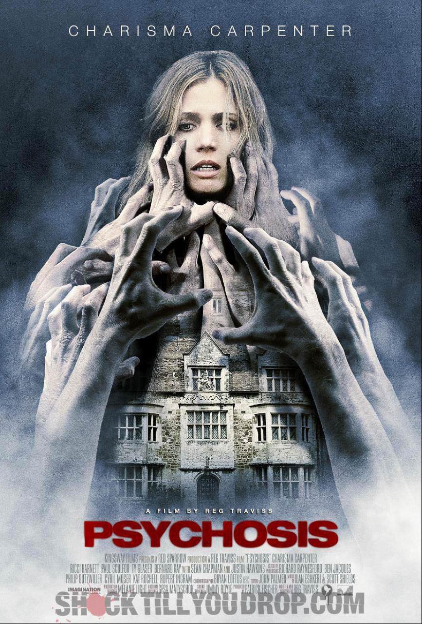
This is a poster for the movie 'psychosis' a psychological horror, I particularly like this poster as it is very unusual - the tower of hands I think are very effective as it looks scary and sinister, we see the hands surrounding the large old house making us curious about the importance of the house. I think when you look at the house and the hands surround it you instantly think - ghosts and a haunted house. Also we see a woman's head at the top of this mysterious house - it all looks very busy and confusing and there is alot to take in. The image in the poster is colourless, which draws us to the title placed at the bottom in bright red - the colour contrasts with the background so our eyes are drawn to it instantly, also the colour red could be symbolic, red means blood or danger so the colour red could symbolise warning and trouble.
The misty background looks dreamlike so it could reflect nightmares or imagination. The poster is very creative as it uses lots of visual effects it does leave alot for the viewers to think about as it creates an illusion of hands reaching out and grabbing this woman and it makes us wonder why this is. To me I find that movie posters are more effective when they make the viewer curious and intrigued which I think makes the viewer want to find out what the film is about giving them a strong interest to go and see the film.
 This poster is for 'A nightmare on elm street', this poster is very dark and mysterious - the film itself is very popular as the first film that introduced the nightmare killer Freddy Kruger was released in 1984, since then there have been 9 films based on the character and this poster promotes the 10th Freddy Kruger film which is a remake of the first film.
 I like this poster as it focuses on the character - many horror film fans would recognise the villain straight away as he is wearing his trademark hat and jumper.The poster does have an element of mystery as the mysterious face is hidden behind the hat so we cannot see the persons face making us curious. Although the poster has a very dark background we can still see the face very clearly - the face is burnt
I like this poster as it is scary by only showing one character - the poster is simple but still effective and has a big impact of the viewer.
Also I do like the tag line ' Welcome to your new nightmare' it sound inviting - it is welcoming the viewer but then the word nightmare adds a twist making the viewer aware that the film is scary and hinting that the film could have something to do with nightmares. 
This is a poster for the silent house, which has not yet been released this poster is quite busy and confusing - which contradicts the title as 'silent' would make us think peaceful and calm - but this poster is the opposite. In this poster we see a face covered up with the Polaroid photos of a woman's face - we do not know if the person in the photo's and the person that is being covered by these photo's. We can assume that they either are the same person or that they are linked in the film. The woman in the photo's looks dazed and confused and she is looking at something that we cannot see making us curious as to what she is looking at. The poster makes us curious as it doesn't give anything away. The most striking thing about the poster is that it is blood splattered - the only thing that links the photo's to the person behind them, are that they are both splattered with blood, this makes us think that they are in fact, the same person.
The splattered blood makes us think that there has been a murder - it hints death, pain and gory violence. The person in the back is wearing white making us think of innocence but then this is questioned as we see the blood stains on the white top - this makes it seem that this person is the murderer, or it is their own blood, or they have witnessed a murder.
For me the initial response that I get from the poster is that a person has been framed for murder (the white colour shows their innocence). Or that they are being hunted by a killer and they are trapped in an abandoned house - hence the title 'The Silent House', if they were trapped in an abandoned house no one would hear the screams meaning that the house is soundproof to others so in other words, silent.
The title 'Real fear.In real time.' makes us think - what is real fear, and what does it mean by 'real time' - this tag line sticks is the viewers mind as they will try to uncover the meaning of the tag line - which makes them curious about the film, this will make them more encouraged to see the film.

This is the official movie poster for the uninvited I like this poster because it is scary and realistic, in the background instead of it being one plain colour we see a grey misty forest putting us on edge and creating a mysterious vibe. We also see the faded images of other characters they are in black and white and they blend into the Forrest making us feel like they are all linked or trapped in this place. Also because they are not in colour and fading into the mist they do not look human or 'real' so it suggests to us they they are dead and are in fact ghosts - the poster links in perfectly with the film as it creates a sense of mystery and makes us feel unstable - like the character in the movie, hinting to us about her mental state. Also the two girls at the front stand out as they look more 'human' as they are in colour, the fact that they are holding hands suggests about their relationship and makes them seem vulnerable to the viewer.
The long haired girl is looking uneasy as she looks away from the camera and she seems frightened and unsettled, making her seem like a victim. The costume the girls are wearing reflects their innocence as white is a pure colour, it also makes them seem quite angelic and ghost like, which could also suggest that they too are ghosts.
If you look closely at the long-haired girls dress there is a blood stain on her dress, showing that she may have died and the way she is standing looks as if she is walking towards us showing that she may be the 'uninvited' persons that the title refers to.
Also another thing that would catch the viewers eye is that behind the long haired girl their is a woman with her arms folded looking at her in a menacing, disappointed way. Also she is folding her arms suggesting that she is being defencive and unfriendly making us feel uncomfortable and making us think that this woman is the villain.
The title of the film is written at the bottom, it is slanted and slightly blurred written in bright white making it contrast with the background and instantly stand out. The way the title is written looks mysterious and ghost like suggesting to us what the film is about.
 This is the movie poster for an upcoming film 'One Way Trip'. This poster caught my eye because it was very unusual and eerie. The poster itself is very dark and mysterious. I like the setting as it is in the dark wood which gives a scary vibe to the poster - I really like how the gnarled tree branches stretch from the corners of the poster to create a border, which I think looks like a door way, this poster really makes you look close to be able to take everything in, what I found very effective was the open mouth at the back of the poster, at first I did not spot it, but I think that it looks extremely scary and effective, the mouth looks as if it is screaming which portrays fear, however the fact that a woman is standing in the centre looking as if she is emerging from the mouth could show that she is evil and the mouth could symbolise her victims screams. The mouth looks like a cave which could hint that the characters are lost of trapped, and the setting could have a relevance to the rest of the film to show that the characters are lost in the woods and are being hunted. The woman in this image immediately catches the viewers eye, she wears a white dress which makes her seem innocent, but then we see that she is holding an axe and what appears to be a human head which completely contrasts with her innocent image. The poster is both scary and intriguing and the title 'ONE WAY TRIP' makes the viewer curious as looking at the image and the title we could assume that one way trip means that the people never return from the trip. The title is written in bold white which makes it stand out against the dark page but also creates an eerie ghost like presence. Also the masthead is very effective as it reads 'losing control is just the beginning' this hints to insanity, which I think puts a viewer on edge, it confuses us and it really sticks in our minds, this is perfect because it makes the viewer curious which will increase the likeliness of them going to watch the film.
  This is the poster for newly released ' Dont be afraid of the dark. This is one of the few posters that I have seen that does not have a main image, this image only shows text, which I think is both intriguing, effective and reflects the film well. The title of the film is the main focus, it is written in a bold calligraphy font, which makes us think the film is set or based on the past. Also I think that it gives off an old fairytale vibe, the background looks like old writing paper making the poster look like the cover of an old storybook, and the title has small sketched images attached to it, the text looks like branches and if you look closely there is a small creature perched on the 'R' of the word dark, which shows us that this creature has something to do with the film, what also catches a viewers attention would be the arm emerging from the 'K' we see that the arm is reaching out to something if you follow the arm we see what appears to be small crushed teeth, the teeth are very small so we assume that they are children's teeth, which immediately made me think of the tooth fairy, making me think that the film would be about the tooth fairy or creatures that take teeth, this is backed up when we read the sinister tag line 'Even fairy tales go wrong' which made me assume that the film is a twist on a classic fairytale - perhaps an evil tooth fairy (the old book-like text and background, the teeth, the tiny creature all hint to this). So I think that this poster promotes the film well, it does not give away the storyline, but it does give us enough hints to make us very curious.
No comments:
Post a Comment